A major reason for choosing a digital asset management tool, like Dash, is to escape the confines of a folder-only organisation system.
I’m talking about tools like Drive or Dropbox that only allow you to organise your images and videos by sorting them into folders.
Sure, they’re easy to use - people have been using folders for years. And they’re simple: your digital assets are either in a folder or they’re not!
But the more folders and subfolders you create, the more confusing and chaotic your system becomes. In the end, these deep folder structures make it difficult to find assets and your teams end up asking you where the latest files are. Not ideal. 🤦♂️
That’s why Dash uses a new way to organise assets: filters and fields. ✨
In this article, I’ll walk through why embracing custom fields, and in turn simplifying your folder structure, will help your users find their visual content faster and easier.
Why traditional folder structures should be a thing of the past
As Dash’s Customer Success Lead, I help a lot of customers set up their new Dash accounts. A trend I see when customers first sign up is their desire to keep the same deep folder structures they were using in Drive or Dropbox - the very systems they’re trying to escape!
That’s not always the best option. Here are some reasons you shouldn’t rely on folders:
- They are really hard to navigate - Users have to know exactly where an asset is in order to find it, and they have to spend time clicking through subfolders to find what they’re looking for.
- They require management - Large, deep folder structures have to be maintained. Do you have subfolders for each year repeated under multiple parent folders? You’ll have to manage that every time you add a new top-level category. 😅
- They restrict searchability - Assets have loads of useful data that folders can’t capture. Data like location, release rights, photographer, dominant colour, number of people in the shot, which team owns the image, what product range it is…. the list goes on. This is too much info to capture in a folder structure - this is what fields have been designed to solve.
By introducing fields, we can create a super-searchable DAM that’ll save you a lot of time.
What’s a Dash custom field?
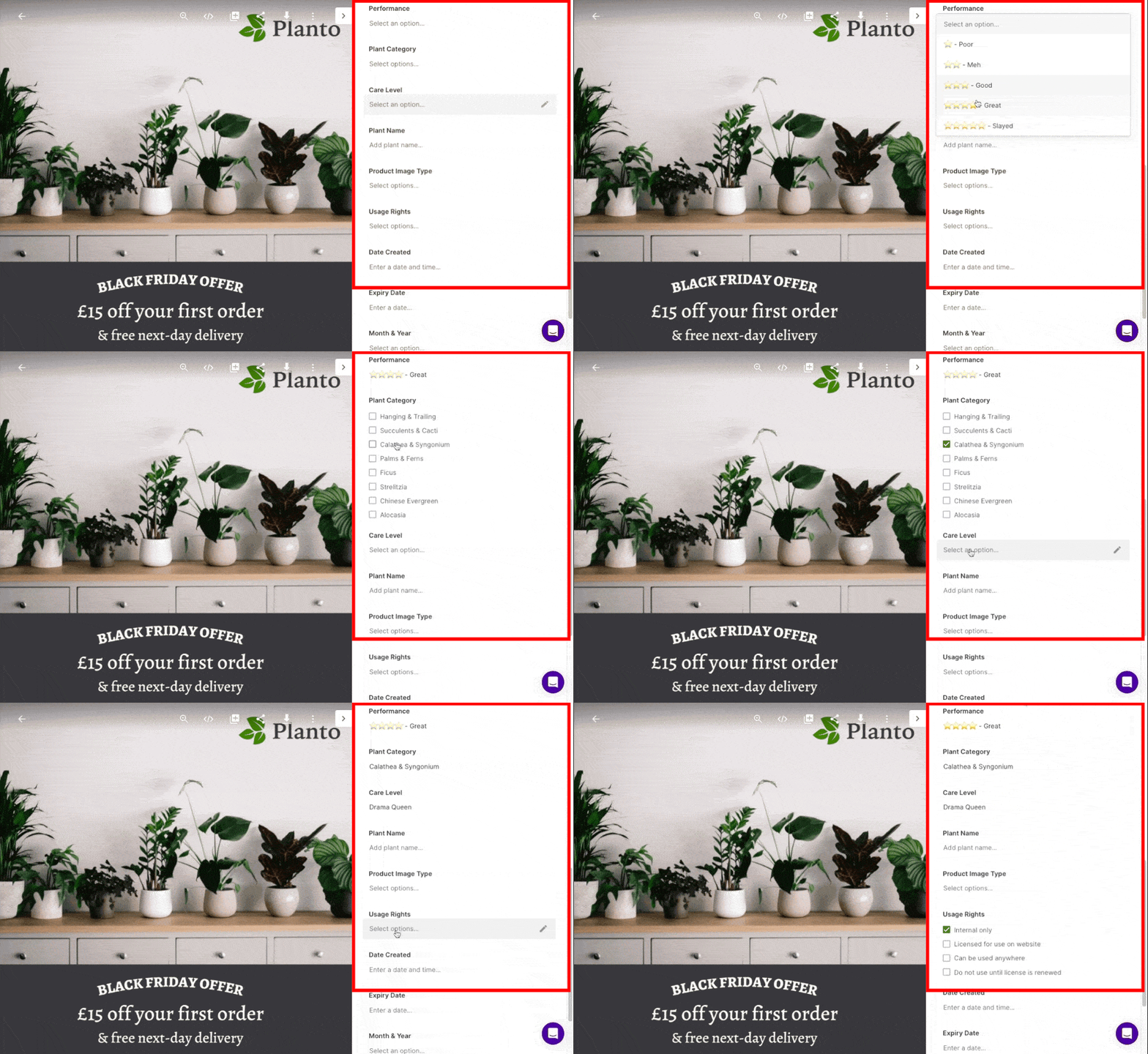
Custom fields allow you to search for useful data about your assets. For example, our fake ecommerce brand, Planto, has some specific fields that relate to their brand:
- Performance level
- Care level
- Season
- Product category
- Photo source
- Usage rights
Here’s an example of me updating the fields against an asset:

In theory, you could use these fields to set up a lengthy folder structure instead. But breaking out this data makes it easy for users to quickly find the assets they need and see important information.
How do I actually use fields to find what I want faster?
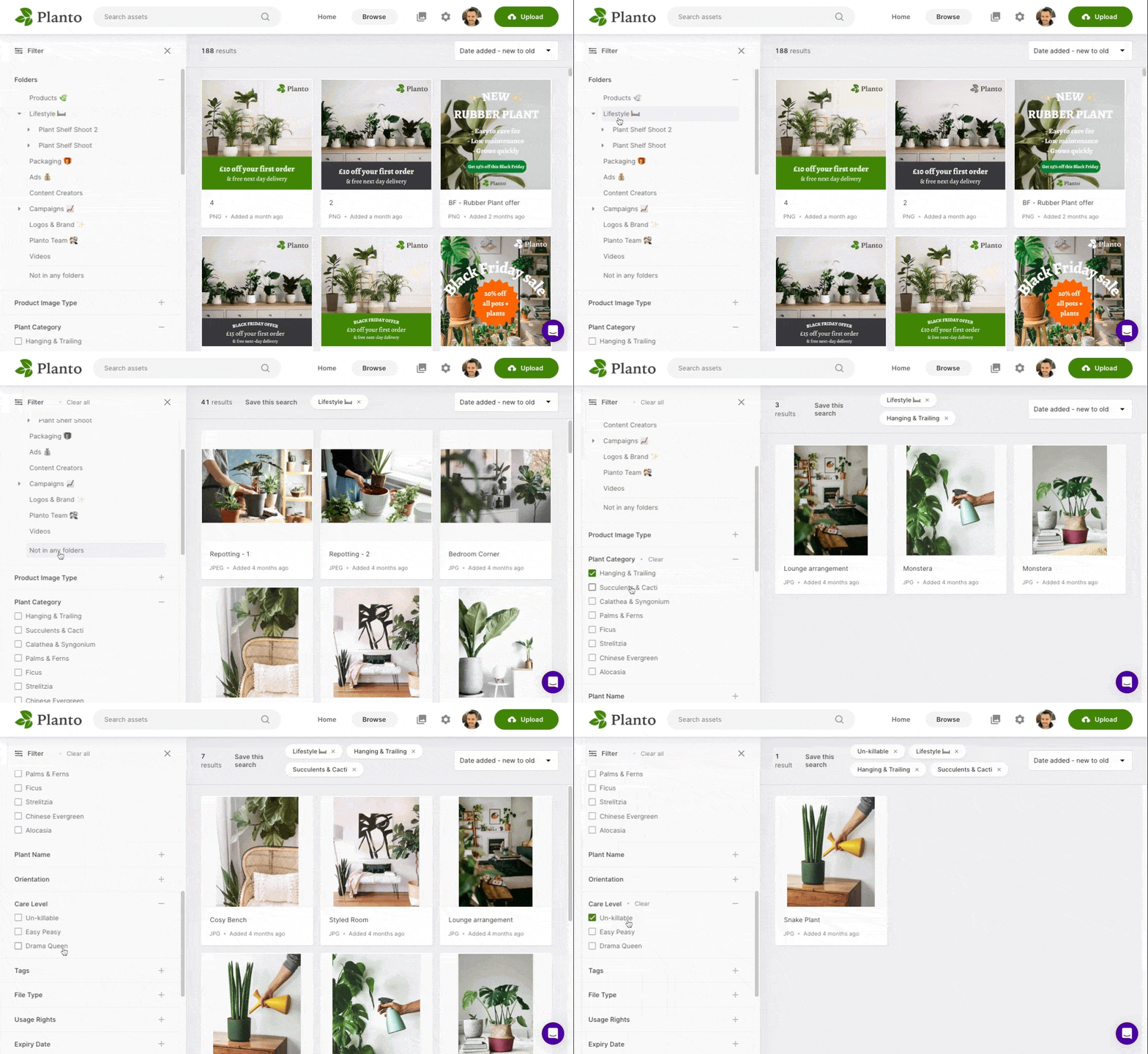
In Dash, you can add any field to the main browse screen, and this lets you filter the view using that field. Filters are simply a way of narrowing down your search using whatever information you know about your desired asset. This is much more intuitive than browsing through loads of folders.
Here’s an example of how quick it is to filter by “lifestyle assets of hanging and succulent plants that are un-killable” in Planto.
That’s quite a lot of information, but it only takes 5 seconds to find the assets that match:

How to choose your custom fields in Dash?
Have I convinced you to use fields? Excellent! 😎
Here are my top tips on how to approach setting up your fields and fields in Dash:
- Ask your users - What useful information springs to mind when they need to find an asset. Are they looking by colour, product name, team, or something else? Their answers will help you pick the fields you want to display.
- Look for any repeated subfolders - Do you currently have a bunch of subfolders that are repeated under lots of different parent folders? For example, you might have subfolders for different years: 2022, 2021, 2020. Instead of duplicating them, you can turn them into filters. For eg. you could have a dropdown list underneath the field ‘year’ with checkbox options for 2022, 2021, 2020, and so on.
- Keep your folder structure clear and simple - it should be immediately obvious to users just by glancing at your folders, what the folders represent. And don’t have loads of stacked child folders - just two or three child folders deep is enough. Any more than that and users start to lose time (and motivation) navigating.
When should I set up my fields?
A common question our customers ask me is: “should I prepare my assets first or just import them all and do it later?”
The answer is almost always to import them now and organise them later. Why? By importing assets first:
- Your assets become accessible to users in your new system
- They’re immediately more searchable because of Dash’s auto-tagging
- It’s much easier and faster to bulk move and edit assets in Dash than it is on a desktop
- You can’t test out fields until your assets are in Dash!
Even better, we can migrate cloud-hosted assets stored in systems like Dropbox or Drive for you. We also offer a bulk import desktop uploader which gets your offline assets into Dash easily.
Should I get rid of folders altogether?
So what’s the outcome of all this? Should you be ditching folders forever?
Probably not. 😏
In Dash, folders are just another type of field that offer their own benefits. They’re still great for:
- Offering a high-level fundamental categorisation of assets, e.g. department or business unit
- Controlling who can see and edit assets by restricting access by folder
- Publishing folders to Dash’s public portals
If you’d like to chat to me about setting up a Dash account, feel free to send me a message via the chat feature on the right-hand side of this post. Or email me: charlie@dash.app.


